Case study · 2025 · Active development

Vapor UI

An animation-first React component library — expressive, copy-paste-able motion for the web.

Role

Solo designer & developer

Type

Open-source component library

Year

2025

Links

React 19Framer MotionGSAPanime.jsThree.js / R3FLottie
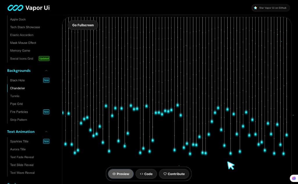
Chandelier background — live preview in the docs playground
01 / 04

Chandelier background — live preview in the docs playground

Overview

Vapor UI is a React component library and interactive playground for expressive motion design. Every component ships with a live preview, syntax-highlighted source, a prop table with live controls, and its exact dependency list so a developer can lift any component into their project in minutes.

I designed and built the entire thing solo: the components, the docs engine that showcases them, and the visual identity that ties it together.

27

Components

5

Categories

6

Motion engines

100%

Open source

The problem

Great motion design lives scattered across CodePens, agency sites, and half-documented snippets. Every time I started a client project, I found myself rebuilding the same reveals, card interactions, and background effects from scratch each time wiring up Framer Motion, GSAP, or Three.js slightly differently.

I wanted one place where production-ready motion components live together: tweakable through props, documented with real code, and honest about their dependencies. Build it once, reuse it everywhere.

What I built

27 interactive components organised into five categories, each powered by the engine best suited to the effect:

Text animations

5

Aurora Title, Sparkles Title, fade / slide / wave reveals

Cards

7

Card Stack, Flip Gallery, Instagram Carousel, Magic Wand Reveal, Canvas Card

Backgrounds

6

Black Hole, Tunnel, Fire Particles, Pipe Grid, Chandelier

Animated elements

6

Apple Dock, Elastic Accordion, Mouse Mask, Memory Game, Tech Stack Showcase

Form elements

3

Action Button, Fullscreen Navbar, Testimonial Carousel

The docs engine

Live preview + code, side by side

Every component page has preview and code tabs — what you see is exactly what you copy.

Prop tables with live controls

Range sliders and toggles let you tweak props in the browser and watch the animation respond in real time.

Honest dependency lists

Each component declares exactly which engines it needs — no installing the whole world for one button.

A showcase that practises what it preaches

Custom cursor, category pages, and page transitions — the docs site itself is built from the library's own motion language.

Technical challenges

01

Taming GSAP inside React

ScrollTrigger timelines and imperative tweens need disciplined cleanup on unmount — otherwise React 19's Strict Mode double-invocation duplicates triggers and leaks listeners. I standardised a context-based cleanup pattern across every GSAP component.

02

One feel across six engines

Framer Motion, GSAP, anime.js, React Three Fiber, Lottie, and AutoAnimate all have different mental models. The library normalises them behind consistent prop APIs — durations, easings, and triggers read the same regardless of what's underneath.

03

Keeping heavy scenes at 60fps

WebGL backgrounds like Black Hole and Tunnel are the flashiest components and the easiest way to melt a laptop. Capped device-pixel-ratio, paused off-screen scenes, and lazy-mounted canvases keep the playground smooth even with multiple demos open.

04

Copy-paste developer experience

The unit of reuse is a single component, not an npm install. That meant every demo's source had to be genuinely self-contained — a constraint that forced better component boundaries everywhere.

Outcome

Vapor UI became my personal motion toolkit components from it have shipped in real client work, including agency sites where expressive motion was the core deliverable.

Building the library taught me more about animation performance, API design, and React lifecycle edge cases than any single client project could. It's also the project that made motion design a signature of my work.

What's next

Publish @vapor-ui/core to npmTypeScript migrationCLI to scaffold components into any projectDocs search & theming